Illustration inspired by a photograph by Werner Mantz
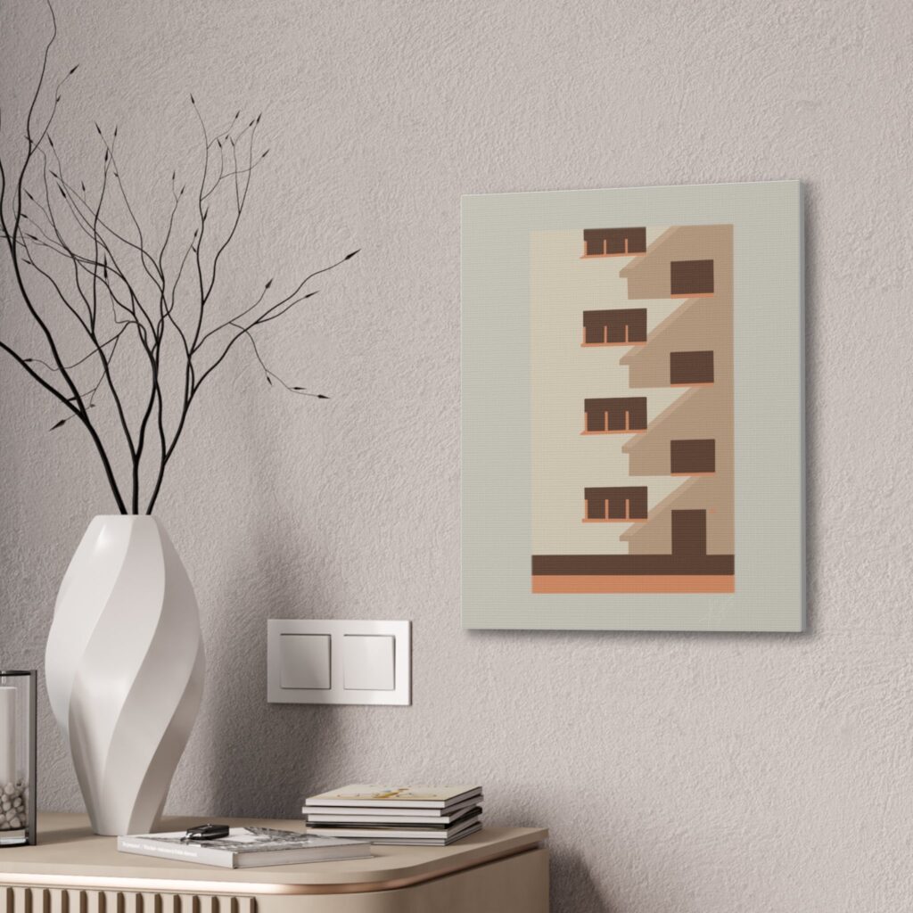
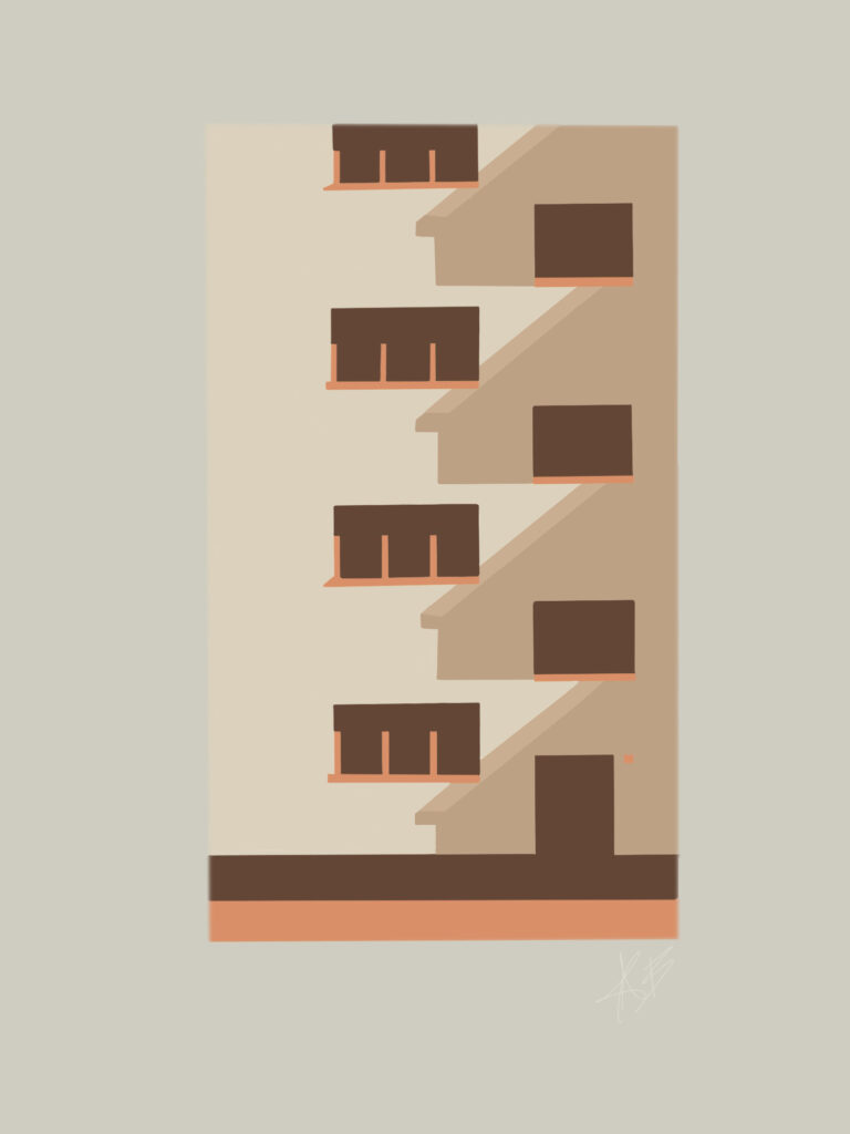
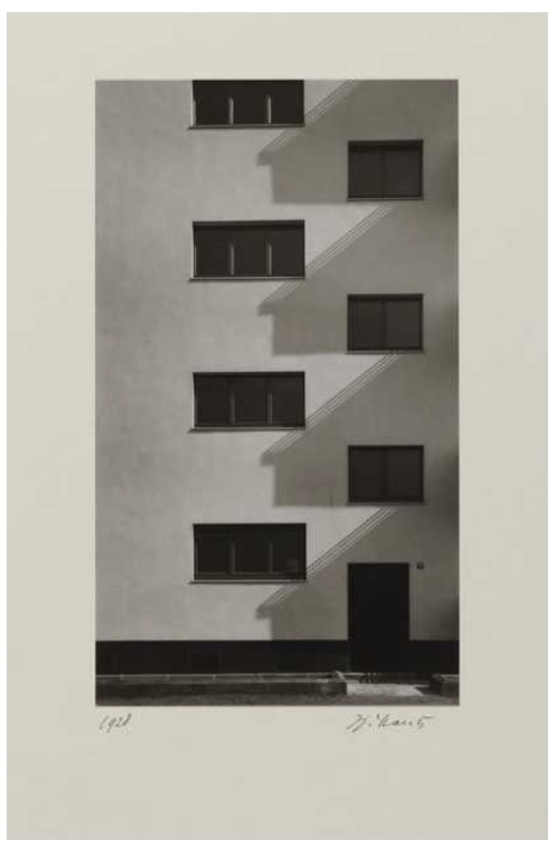
Detail Kalkerfeld Settlement, Cologne (1928) is part of a portfolio of ten small, black and white gelatin silver prints that were selected by Mantz towards the end of his life as representative of his finest work. They were reprinted in 1977 in collaboration with the Berlin-based gallery Schurmann and Kicken. Each print is signed and dated at the bottom of the image. This photograph reveals Mantz’s skill as a photographer of architecture.
I chose this photograph to work with as I love geometry based photographs of “clean” coloured architecture. I tend to work with cool or warm tones using chalk where as for this photograph from Mantz that I’ve chosen to work from I’ve selected the use of warm tones. Mantz himself used more cool based tones by having it in black and white while keeping the strong shade of tones to create a more intense and drastic contrast to highlight the geometry. By the use of this strong contrast I wanted to experiment with warm tones to still show those sharp horizontal and vertical lines. This allowing the strong tones to highlight the geometry that was beautifully photographed by Mantz.
Additionally this photograph was based around the World War in Germany where his cool tones target that representation of how in depth the emotions were experienced during that time frame.
Geometric Patterns
Geometric Patterns created from an illustration by me


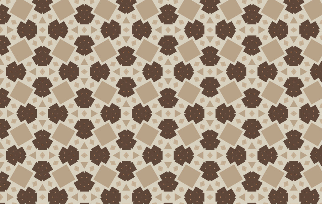
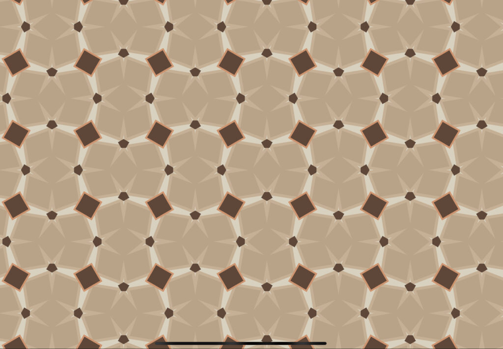
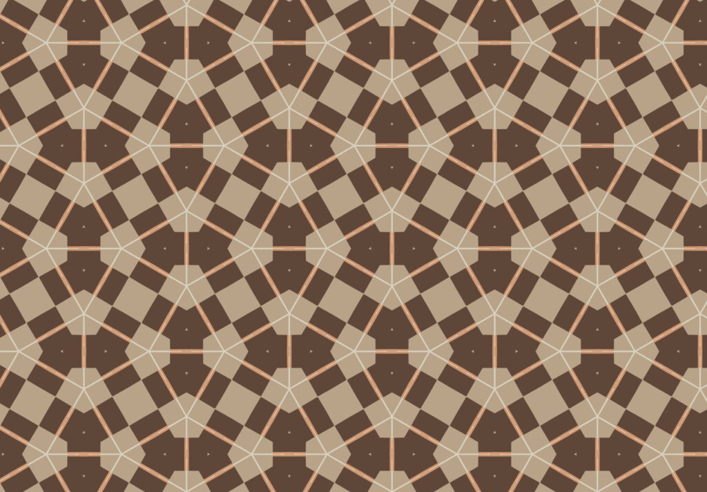
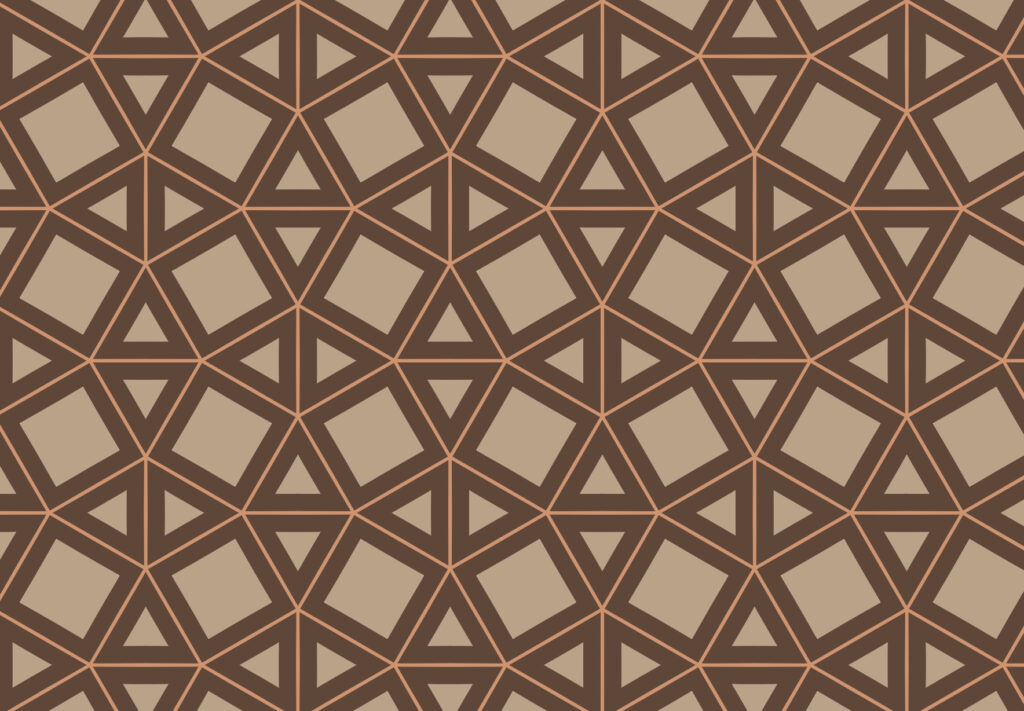
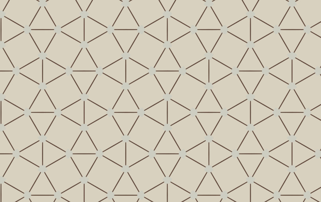
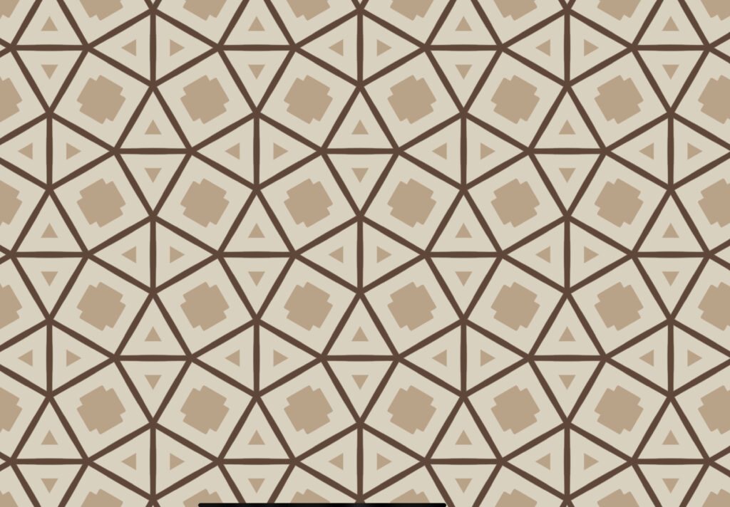
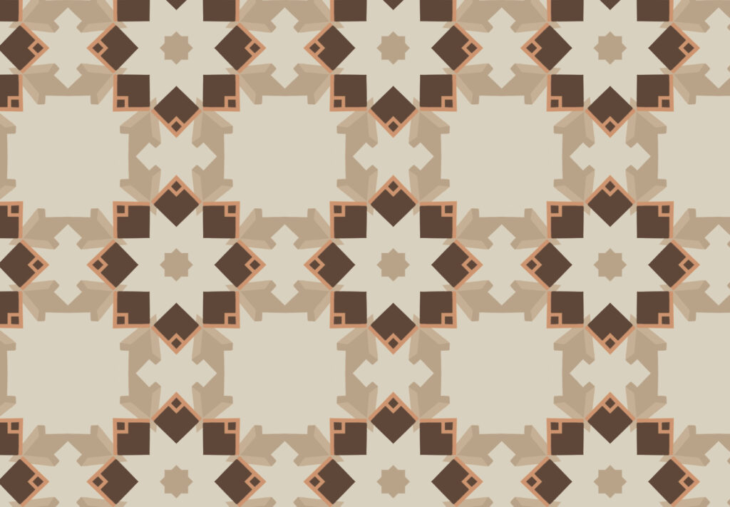
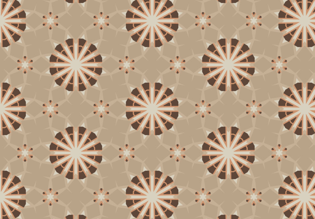
As seen above using the illustration I made inspired by Werner Mantz’s photograph, I selected certain sections of the image to create patterns. Using the software Repper I selected this image of the illustration where I was then allowed to select a specific section of the image. I could change the size of the sample and once the area and size of area was selected on the image, you were then given a list of options. The type of tiling, the rotation and angle of the selected sample.
I’ve attached a link of the software below:
Testing the creation of patterns using a simple geometric figure: A Heart


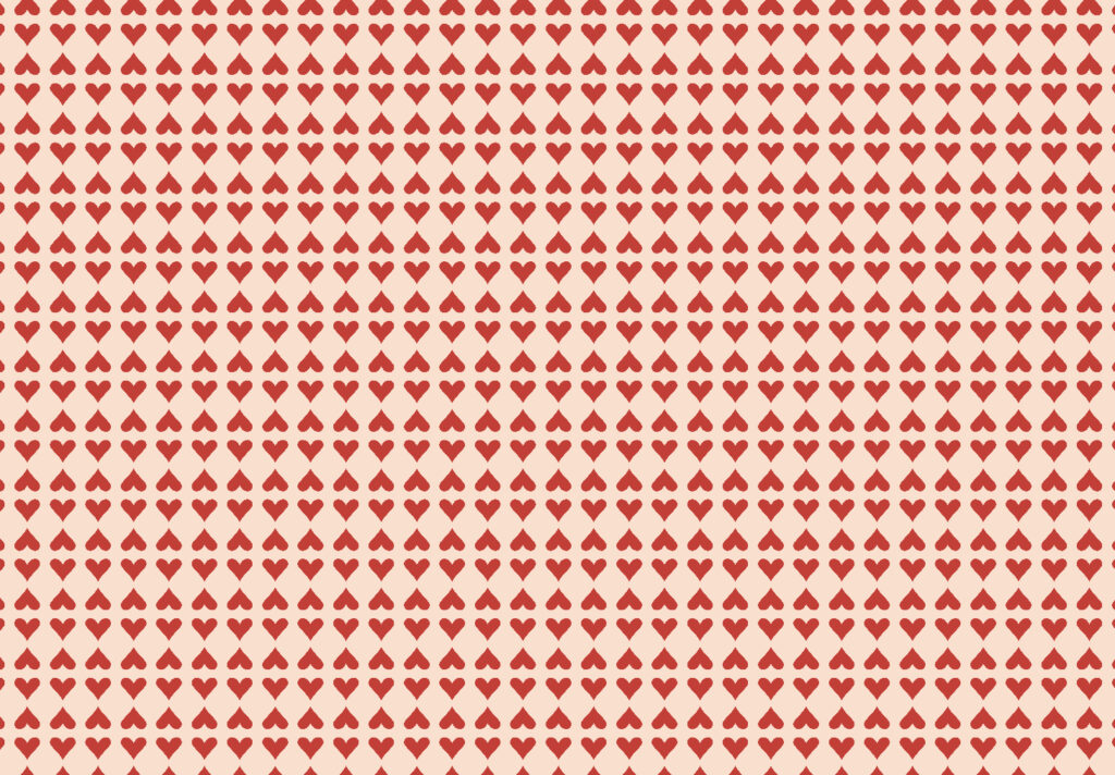
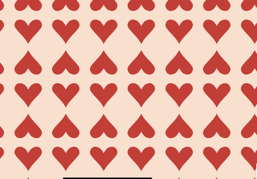
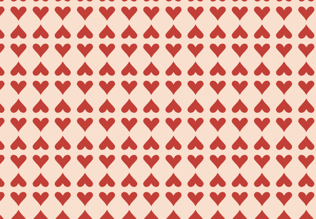
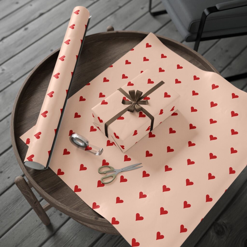
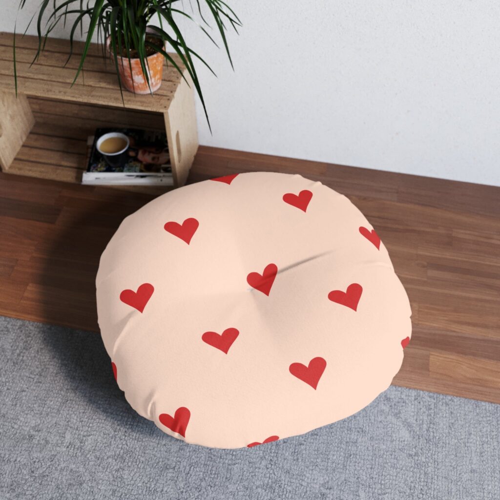
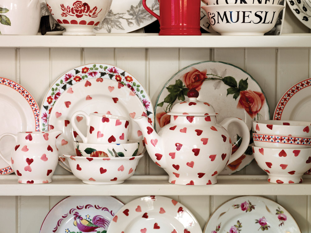
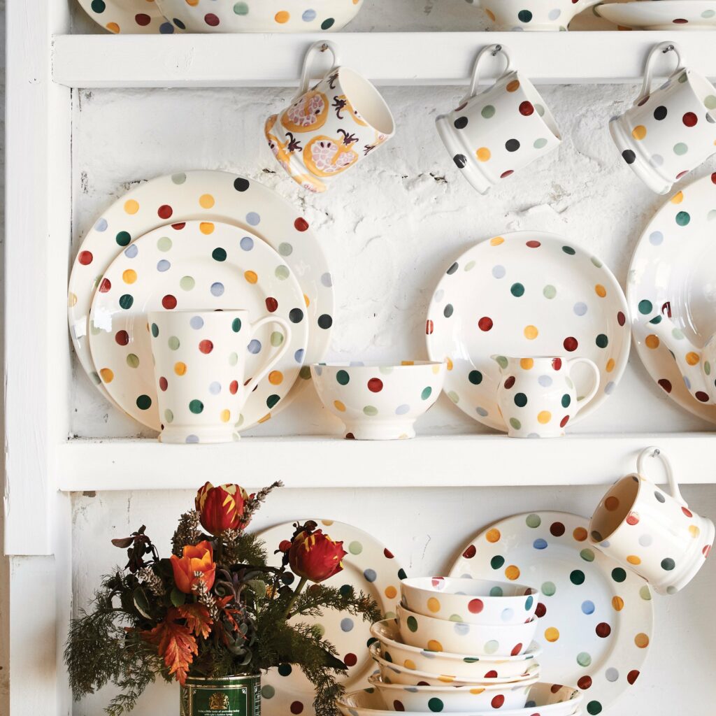
What inspired me to use this simple pattern as well as the selected tone of colours, was my Granny. I grew up with my grandparents and my mother, where my Granny was a collector of random bits and bobs. Her favourite thing to collect was Emma Bridgewater’s Pottery collection. The Last two images added to the above selection of photos are examples Emma Bridgewater’s Pottery.
I didn’t want to copy her style but the use of a simple heart or polka dot was what called to me to start off with the experimentation of pattern making. This was the first pattern I had created so far digitally and even though it’s so simple and may not be special to others, it is a personal touch to me as a reminder of my loved ones.
Furthermore, I decided to experiment placing this pattern on physical items that are used just as Emma Bridgewater did but instead of pottery I decided to relate one with a house item as well, such as, a cushion for a dinning table. Also, I chose wrapping paper as it reminded me of Valentine’s which I found rather sweet since it represents love and that’s what this pattern was made from.
A gift for my Granny who I love ever so dearly.
Creating a Pattern Through an Illustration by Design Shifu
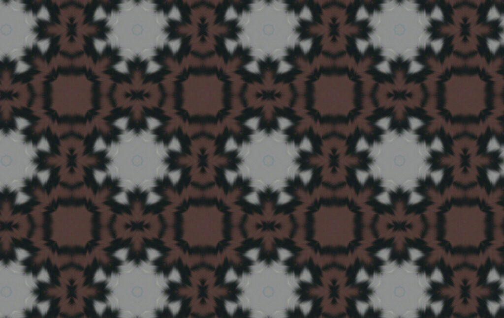
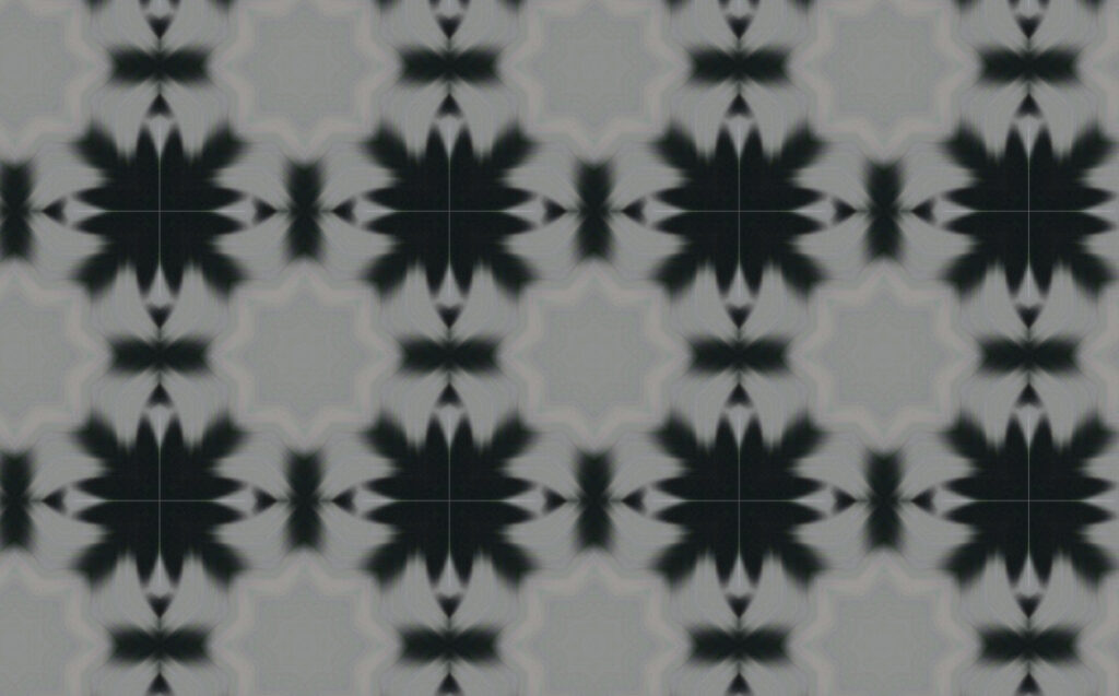
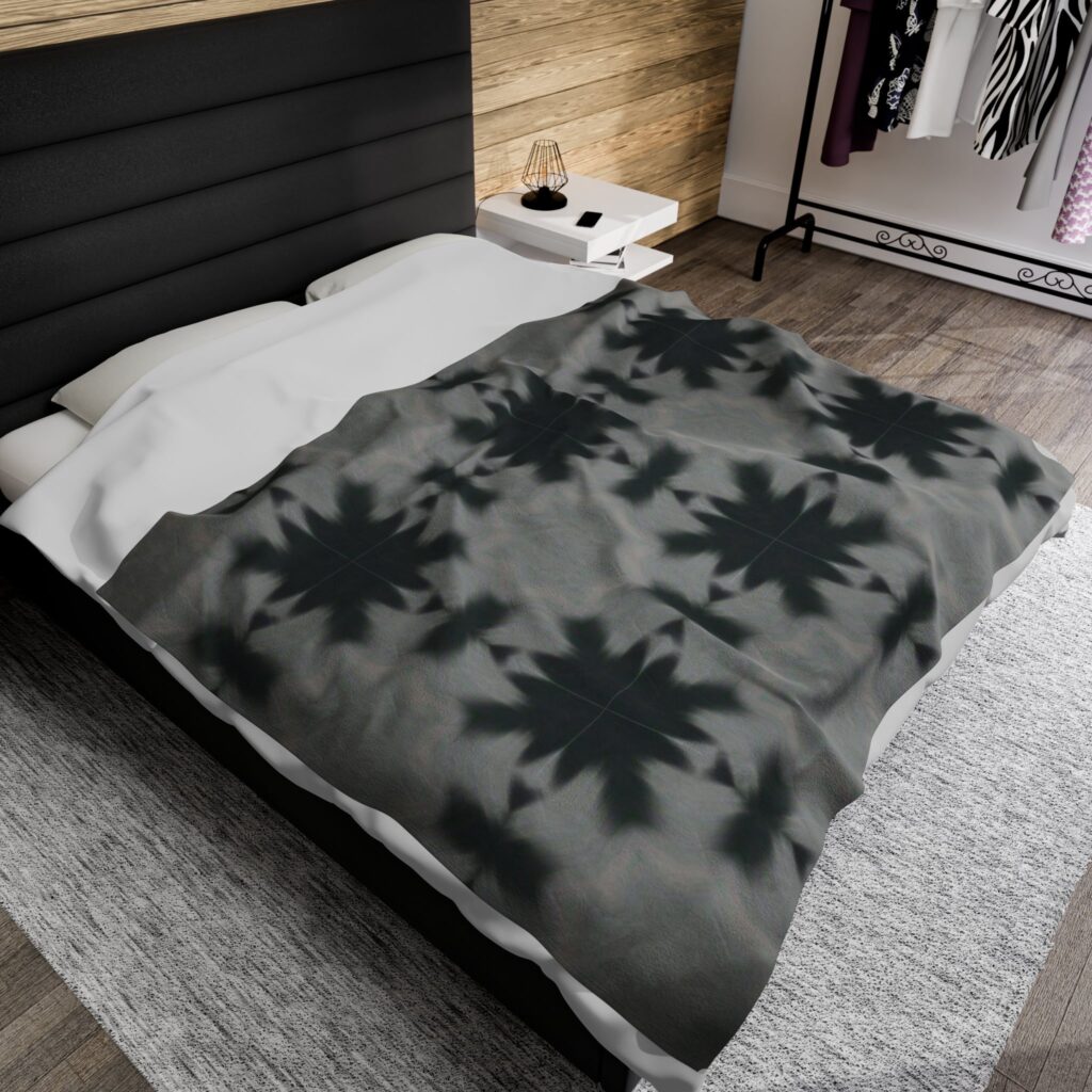
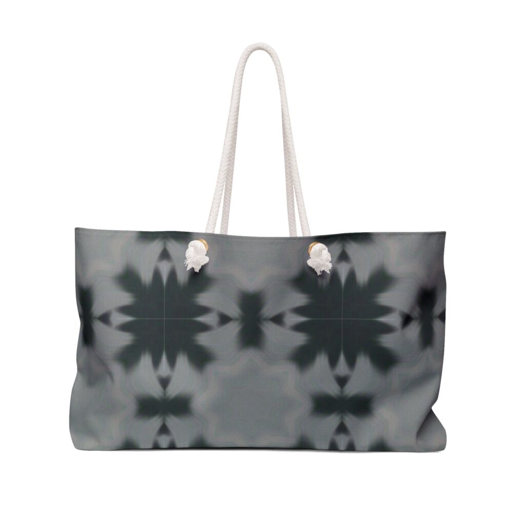
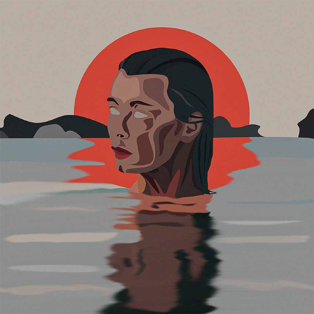
I was intrigued by the selection of colours and blur technique used in this illustration by a digital artist I found on the internet. I’ve tried researching for the original artist and if I’m not wrong it is by Design Shifu which unfortunately doesn’t necessarily have a background story to the artwork.
The reason I chose this artwork to work from is due to the colour selection as I mentioned prior my greatest interest is warm and cool tones. The reflection was what grabbed my attention as the previous patterns I created were based on solid geometry and strong contrasts of colour where there were no “leaks” of colour nor soft blends. I decided to use the same technic I had used with my own illustration to create a pattern using this one but only using the selection of the bottom half of the image. The one image using brown and the other avoiding the usage of brown gave entirely different moods and tones. Brown is more warm so instantly the one without the brown is a cold image. In fact the way the pattern was shaped reminded me of snowflakes, as if it were Christmas due to colours as well.
As I had previously placed the Heart shape pattern on physical objects, I decided to further experiment this with this new pattern. This time on a bedsheet and a bag. The reason being for the choice of a bed sheet is i personally find it difficult to find nice new bedsheets. I decided to take into a product design perspective as myself being the audience. My question was to myself “what is one of the main products that I struggle to find that’s main characteristic is the pattern/image itself.” From there, I experimented by placing the image on the bed itself and I loved it. Then after creating the mock up an item recommendation showed up which was a bag. To me it looked like a beach bag due to the ropes and I decided to add the pattern onto it as well to experiment on a non-flat material. Most beach bags are warm tones or very simple patterns or colours. This pattern was a lot more complex for a beach bag which was what originally got me thinking to experiment on it. The cool tones, the blurred pattern, the large zoom in etc. It came out very unexpectedly dramatic which I was quite fond of.
Illustrating Patterns
“The life of rats” by me, Aliyah Bate
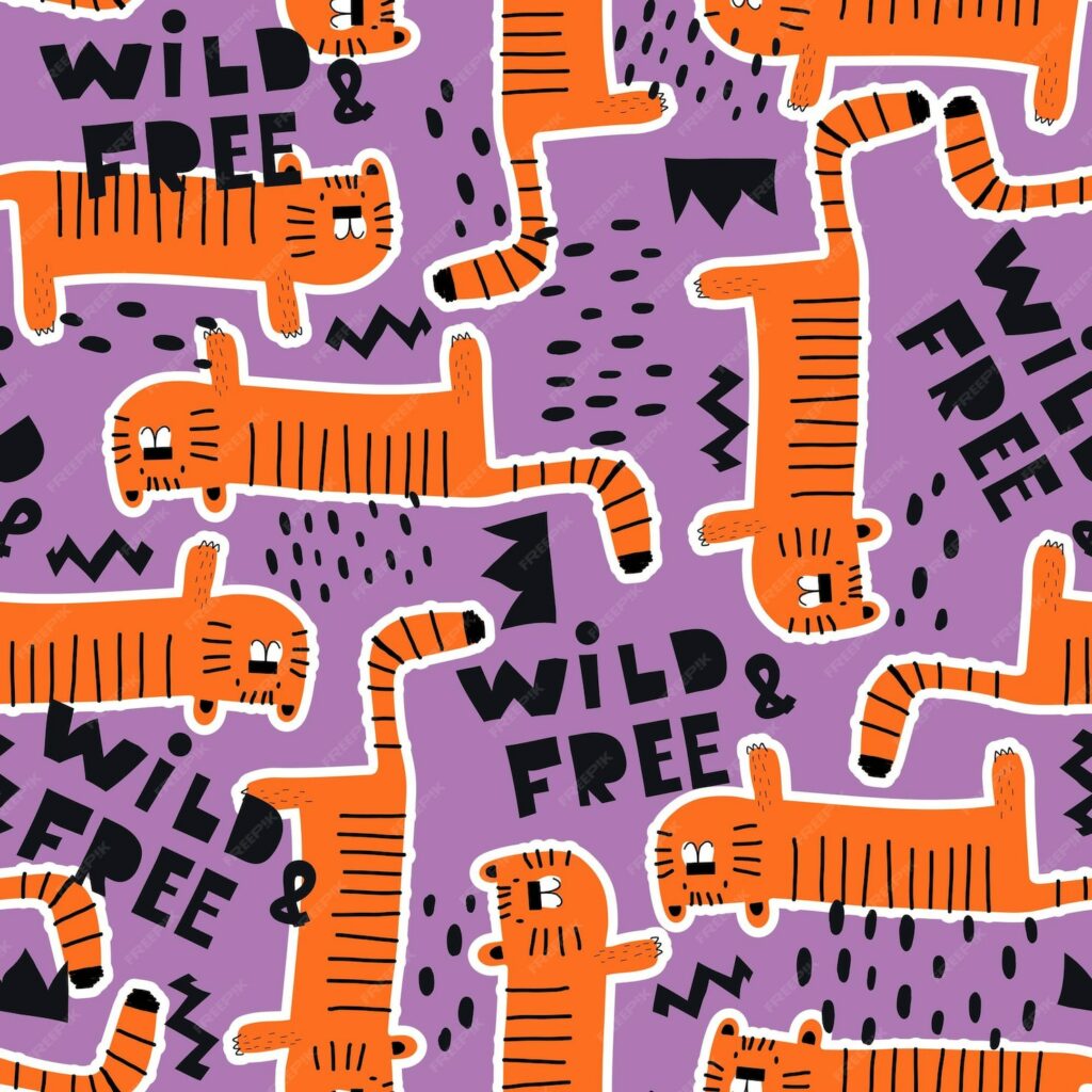
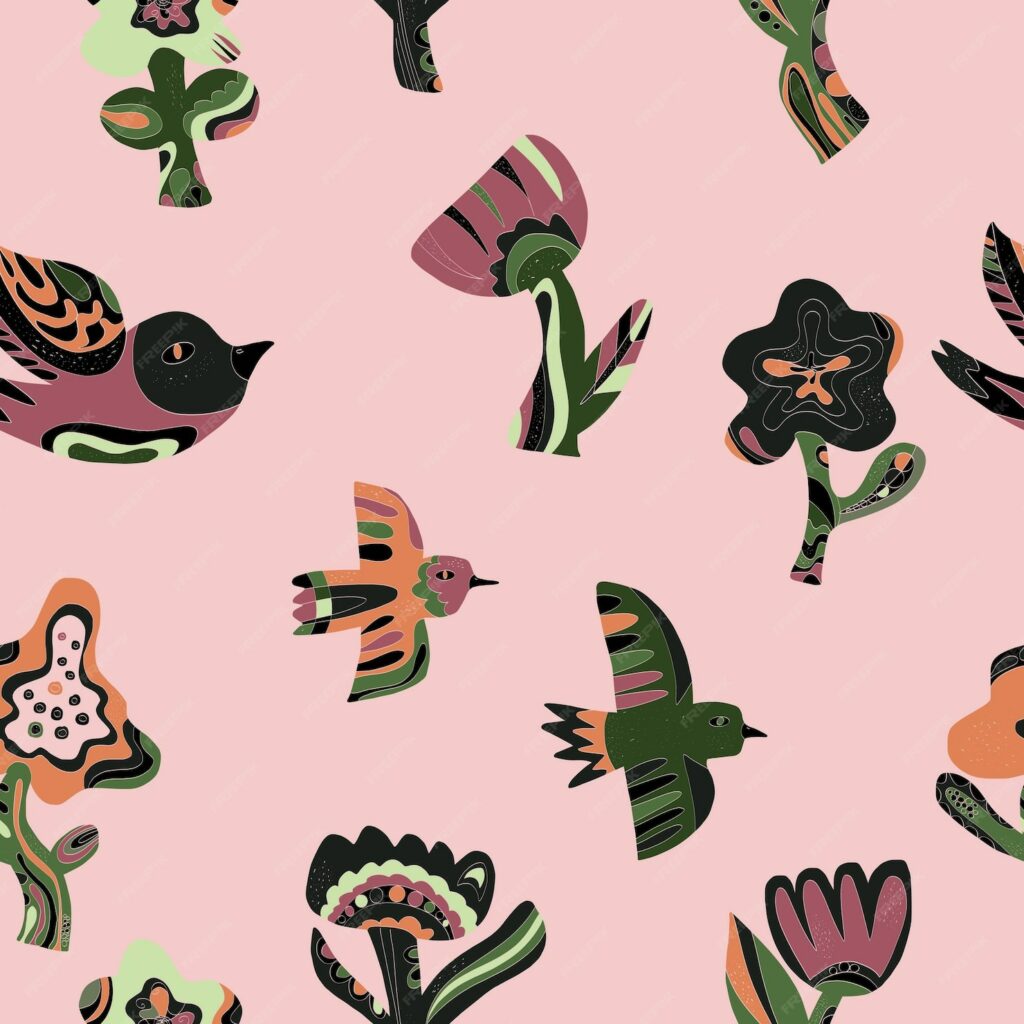
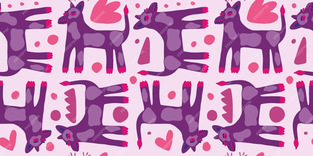
This images were retrieved from the website Freepik:
https://www.freepik.com/: Illustration and Graphic DesignHere are 3 images of illustrated patterns that caught my eye for inspiration. I wanted to dive further into patterns using illustrations made by me. I love working with a set theme of colours and tones as well as general topic such as nature. These 3 images each represent an animal: a tiger, a bird and a dog. Personally, I wanted to express this into my own artwork with the further inspiration of my own pet rats. I have 4 rats in which they’re of 2 pairs, where the pairs look identical yet have their own differences. This is ideal for my pattern work as it will keep the consistency of similarity and pattern.
However, I didn’t want to use their original hair colour and eyes as I like how these 3 art pieces have a set colour theme to them.
I’ve chosen a warm set of colours as I hold them close to my heart and they’re very dear to me. I want to portray this feeling with warm colours as my pets give me a sense of warmth.
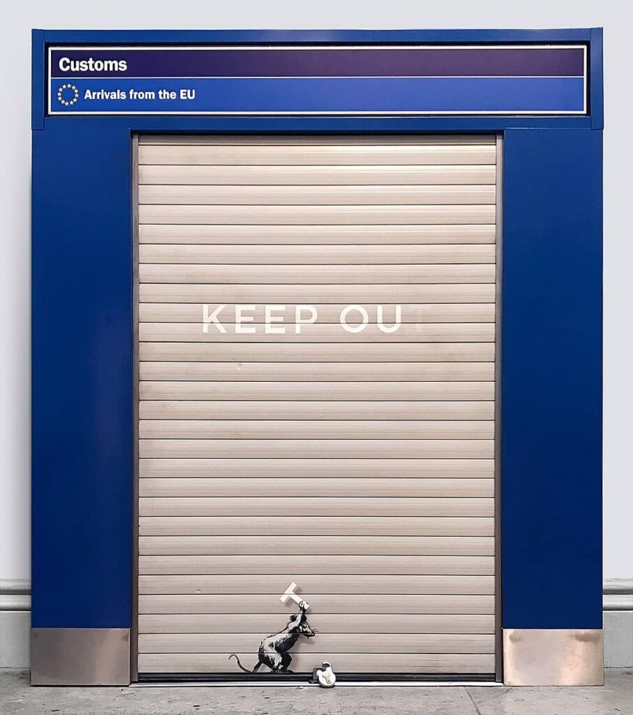
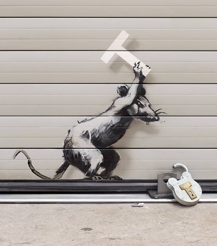
This artwork of a rat was done by Banksy, “Archway salvaged from Heathrow Airport.”
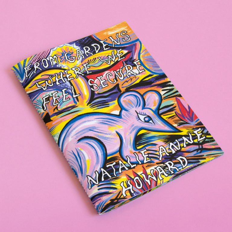
This artwork of a rat was done by Natalie Anne Howard, “FROM GARDENS WHERE WE FEEL SECURE”
The publisher says “The zine is inspired by the blooms and critter movements of spring gardens, featuring 28 original paintings and a poem by artist Sojourner Truth Parsons.”
Both Banksy and Natalie have their artwork including sentences. Myself, I’d like to include some form of a word or sentence on my artwork within the pattern to portray a message as did Banksy and Natalie.
When I think of a rat outside of my own, I think of the mouse called “Dormouse” from Alice in Wonderland and the poem called “To a Mouse.” Rats are always overlooked by mice due to their looks, it’s very common for people to be taken back by rats due to their size and their tail. Where as mice are small and their tail too, making them far less intimidating and scary. However, when I think of a mouse I think of a delicate, innocent, fragile and lost creature. When it comes to a rat I think of a strong, feisty, smart and resilient create. Dormouse in Alice in Wonderland reminds of a rat due to its stubbornness and courage.
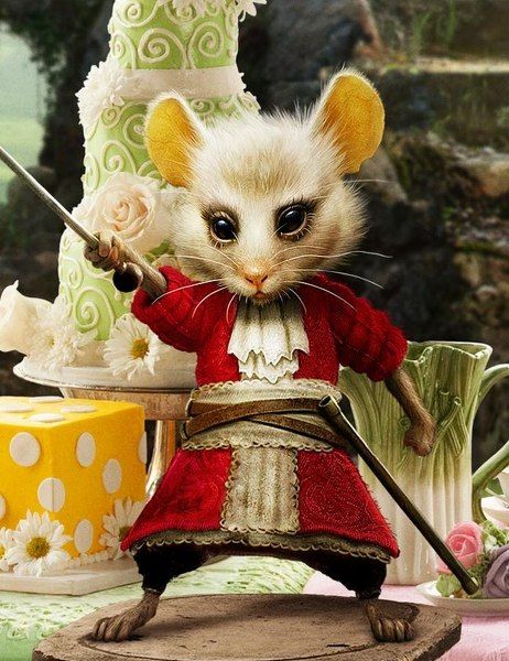
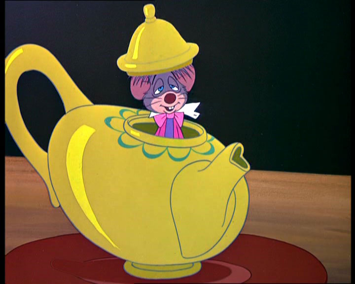
The character evolved over the further adaptations, originally he was sleepy and lazy due to hibernation but in the 2000s films the mouse is courageous, hyper and a fighter. I feel as though both are equal portrays of the mammal as my own rats can be sleepy all day and then the next they’re play fighting, hyper and curious. I want to portray they’re active and crazy side in my artwork but I may take inspiration of the animated drawing of the Dormouse from the 1951 Alice in Wonderland.
In “To a Mouse,” my favourite line in the poem goes:
I’m truly sorry man’s dominion
Has broken Nature’s social union,
An justifies that ill opinion,
Which makes thee startle
At me, thy poor, earth-born companion,
An fellow mortal!
Rats and mice have a bad reputation for being gross, scary, infested with diseases and just bothersome. I want to show in my artwork the good side of them and how they’re lovable.
For the text that I want included on my artwork within the pattern, I’m going to start off with creating my own poem to help me find further inspiration.
My Poem “Dear Wee Rats”
Tiny fingers, twitching noses,
whiskers that sense who’s closest.
Curious wee faces,
so bold and gracious,
how much you mean to me,
I wish it was more contagious.
They call you pests, they face away,
missing out on your desire to play.
Gentle, Clean, and no way mean,
if only they would see,
what a great pet you can be.
You climb up me, so full of trust,
a bond to be, a love that’s just.
No fear, no scorn – just warmth instead,
my wee rats, so soft, so gently and sweetly led.
Before illustrating the rats, I want to start off with creating a colour palette, and illustrating the surroundings of the illustrated rats.
As mentioned prior, the colour palette is to be warm tones of bright colours. For the surroundings, I wanted to gather objects that correlate to rats but making it abstract. My rats’ favourite snacks are berry yoghurt drops, oats, popcorn, pumpkin seeds and basil plants.
Radial Symmetry
Radial Symmetry and Mandala-Like influence by Me (Aliyah) and help by Valentina
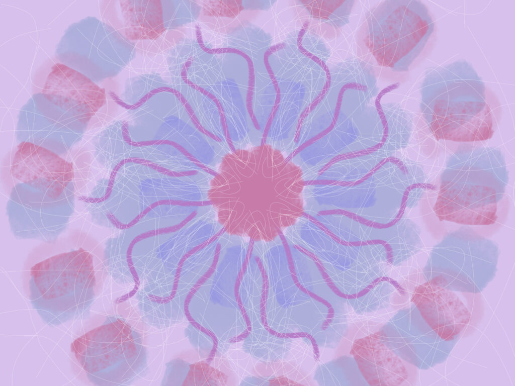
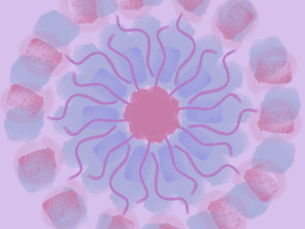
A fascination I have is patterns, prints, geometry, layering and working with angles. Here I made digital art where I used a symmetry tool on a software called Sketchbook where I created this Radial Symmetry artwork. I wanted to remove myself on my biggest passion which is warm and cool tones where I love the chiaroscuro technique as well as strong colour contrasts.
For this artwork, I have selected soft pastel-like colours which are colours I tend to greatly avoid as these colours are hard to create drama with. While experimenting with the symmetry tool it began to look like a dream catcher. Dream catchers tend to be made with feathers, beads and tend to be woven. Furthermore, dream catchers are usually created with bright and light colours. For example, a white dream catcher symbolises spiritual illumination, calm, and purity.
I restarted my artwork and started using very light pastel colours where I would change the angle of the symmetry tool to lightly layer the different brush strokes I used. The digital brushes I used widely ranged from chalk, watercolour, oil, pen etc.
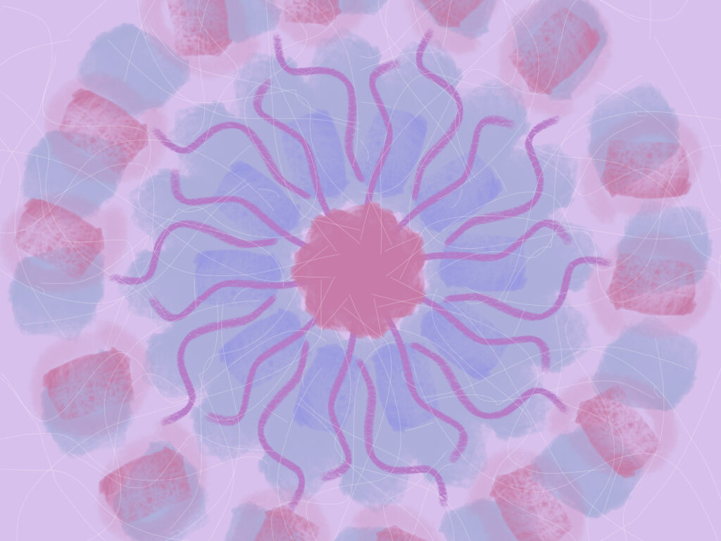
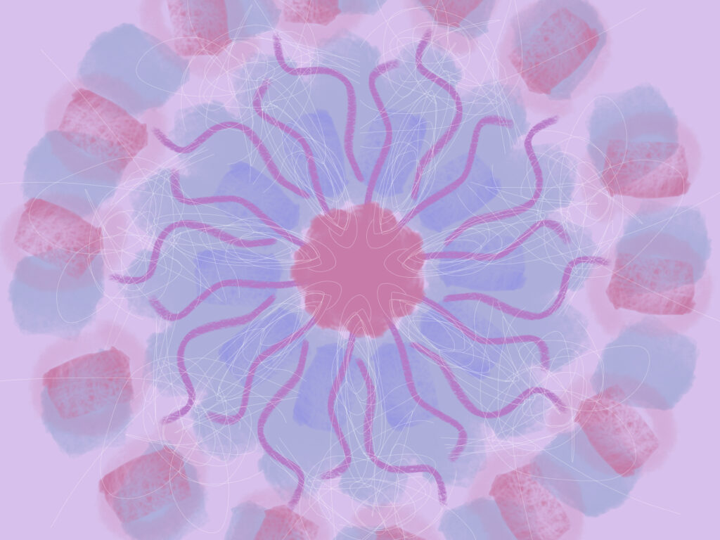
However, once finished, I felt as though something was missing. While I was in my headspace trying to think of a technique/material or anything to add, suddenly my sister, Valentina, (4 years old) grabbed my tablet and started drawing. She selected the cursive pen, the colour white and changed the sizing to thin. She instantly started squiggling using the symmetry tool. I was upset at first and then realised she was onto something. The entire way through me doing my art I explained why, how and what I was doing to my little sister. She listened to everything I had said and as I was in the process of coming up with what to do with the colour white, she went for it. The fine lines gave that detail I was looking for. Everything was clean and strong shapes. I was missing the messy and free flow which as a combination of all to me personally, represents a dream catcher.
Together we made multiple different layers of squiggles but came down to 2 favourite different layers.
I’ve placed the images below of the art before and after Valentina came to help. Show casing the original, the 2 images of the 2 different layers of white pen and a further image of the combination of both layers. This combination of layers lead to the final piece.

Why Radial Symmetry and the Mandala-Like inspiration?
The artwork (Valentina and) I made has a clear center with patterns radiating outward in a balanced and symmetrical arrangement. This central-focused symmetry is a key feature of mandalas and conveys a sense of harmony and calm. Radial symmetry is often used in art forms that are meant to evoke mindfulness or meditation.
While it’s not a traditional mandala, the overall design was inspired by some of its principles. These principles being: balance, symmetry, and repetition. Mandalas are symbolic in various cultures, representing the universe, spiritual journeys, or inner balance.
This leading to why it reminded me of Dream Catchers. In order to continue this onto a perspective of an outside audience from a personal perspective I manipulated the colour choice, the brush strokes, the layering etc. Below I’ve given an in depth description on how that mood was represented in this art piece.
Outside of me avoiding the cool and warm tones for this art work, I also wanted to keep the use of geometric patterns. However, I didn’t want to make the artwork so rigid, linear or stiff as before. I wanted it to represent freedom.
The wavy, flowing lines create a sense of movement and energy, adding a more fluid feel compared to rigid geometric patterns as I mentioned. These lines are often seen in abstract art, symbolizing the natural flow of life or emotions. The curving shapes suggest a connection to nature, reminiscent of petals, waves, or other organic forms.
The choice of colours are gentle blues, pinks, and purples. This choice of colours gives the artwork a soothing, dreamlike quality. Pastel colors in abstract art are often used to create a calming atmosphere and are associated with serenity, which can be therapeutic or meditative.
The artwork uses layered, translucent brush strokes, adding a sense of depth and softness. This layering adds complexity to the piece, further giving it a sense of dimension and richness, which allows it to feel like a blend of watercolour and digital art with an ethereal quality.
In conclusion, the experimentation with colour, form and fluidity has really helped me discover more about my artistic capabilities. I can now possibly even use this style in decorative art, graphic design or even as a therapeutic art form due to its meditative qualities.
Valentina’s Artwork
Valentina, my 4 year old sister, her own Radial Symmetry artwork.
Valentina, my 4 year old sister, was so inspired after my art piece that she wanted to create her own Radial Symmetry artwork. Below you can see the 2 images of her digital artworks.
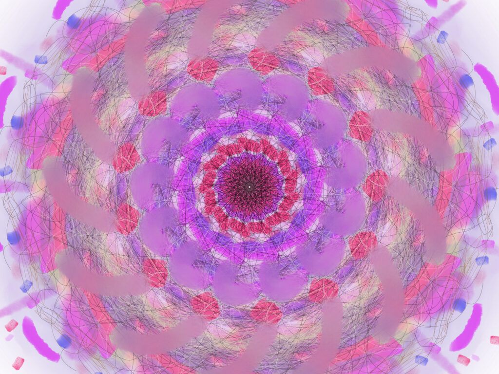
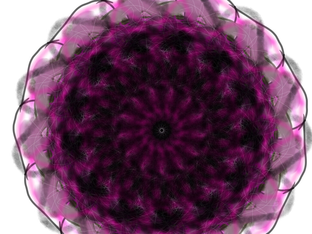
Valentina used the software Sketchbook where she created an artwork based on Radial Symmetry using the symmetry tool. Valentina used a very wide range of digital brushes including an airbrush, watercolour, chalk, oil, pen, pencil, rubber, acrylic, marker, and even a paper blend to smudge.
Seeing her so inspired by simply watching me do my artwork and getting the opportunity to help was so heartwarming. Later, being able to give her the space to her own creative freedom, watching her come up with her own methods and just seeing all the joy that came from it was everything to me. It’s definitely a reminder of why I started art in the first place. Being a kid with a great imagination and having the freedom to express your emotions.
Valentina’s Abstract Minimalism artworks
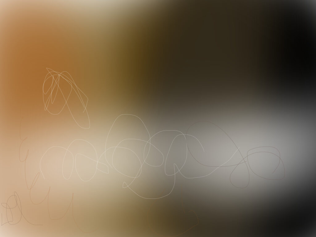
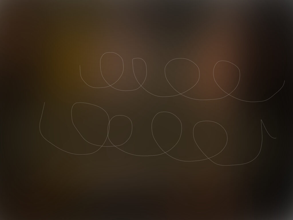
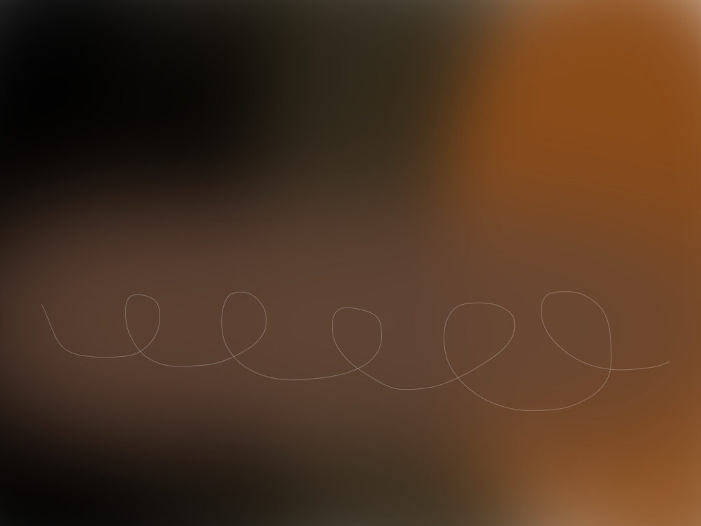
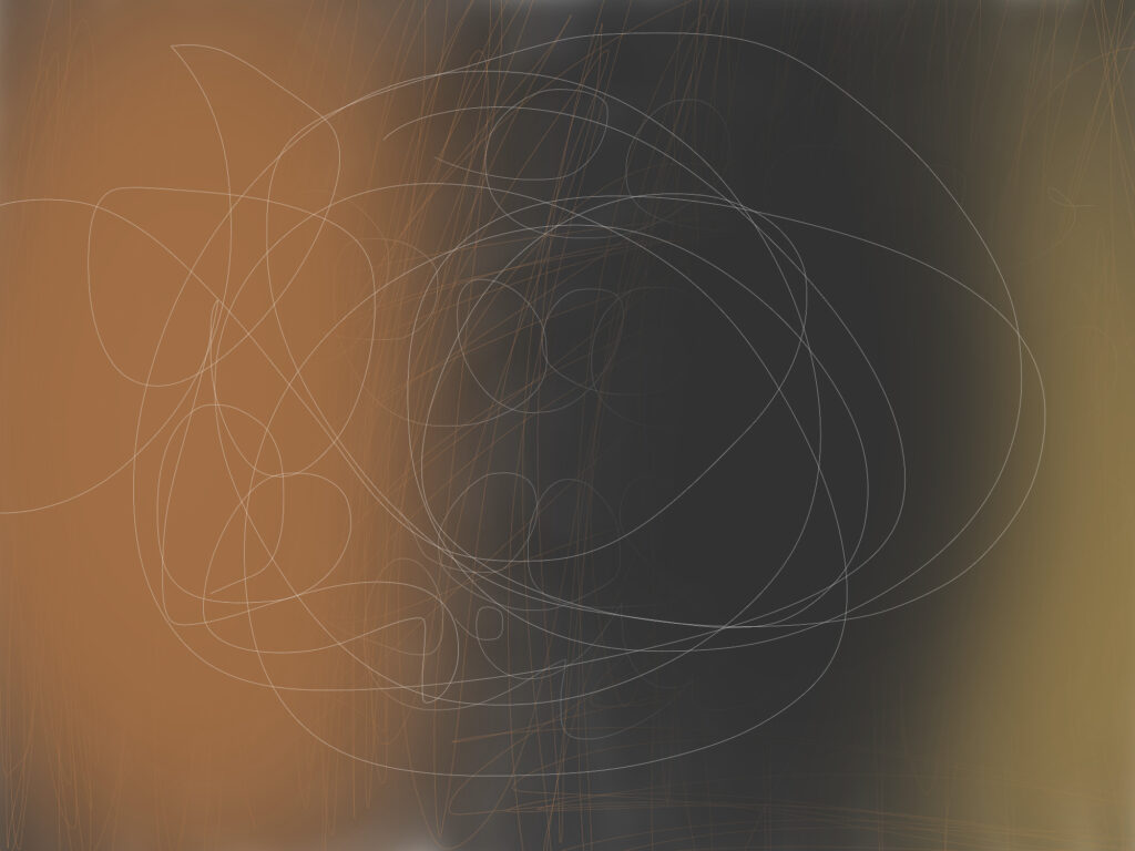
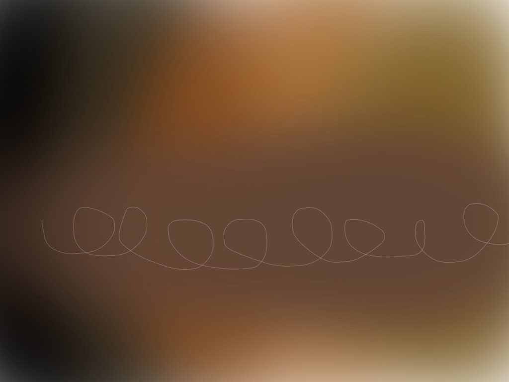
While doing artwork with my little sister, I was explaining to Valentina about warm and cool tones as well as colour contrast.
Both Valentina and I were experimenting with different digital brushes, where as, she chose the colours. I helped her figure out how to blend the set colours to create that gradient of colours. The set colours Valentina selected are muted and evoke a sense of depth and warmth as the palette reminiscent autumnal or rustic hues, giving a grounding effect that additionally compliments the abstract, flowing lines in the artwork.
The muted colours, blurred gradients and thin, loose lines, create an effect that emphasises simplicity and ambiguity. The overall aesthetic combines soft, diffuse backgrounds with spontaneous, flowing lines, which can evoke an emotional response without depicting any specific object or scene. This style can draw from contemporary abstraction, focusing on mood and form rather than realism.
